Building a Personal [Origami] Website in 2021
In early 2021, I rebuilt my website at origami.kosmulski.org from scratch. It was a complete redesign which started with planning what I wanted the site to be and who its intended audience was, followed by looking at a few potential technologies, checking them out and choosing one, building the site, and tuning its load times and SEO. While a few details are specific to origami, most are completely general and should be interesting to anyone planning to create their personal web page, regardless of topic.
Do I need a website at all? What for?
Creating a website would certainly cost me a lot of work, so the questions to answer first were: do I really need a website at all and what should the purpose of the site be?
Here are my site’s raisons d’être:
- To present and promote my origami work: most of all, origami models, but also folding instructions, paper reviews and other pieces of text;
- To provide a knowledge base about my designs for myself: you actually start to need such a thing after you design the first few dozen models;
- To be a single address which I can give to people interested in my origami work.
Just as important as setting goals for a project is defining non-goals as well:
- Not a general-interest site about origami;
- Not an origami database about different creators such as Gilad’s origami database;
- While I sometimes perform commercial work related to origami, this site would not be an online shop or an outlet for promoting my services;
- Not a social media platform: I will be the only author of content on the site except perhaps for visitors’ comments on blog posts.
What do I expect from my site?
Here are some properties I wanted my page to have. Requirements like these can profoundly affect the choice of technology, and the site’s overall design.
- Easy to update: I usually post 1-2 pictures to social media each week, and I wanted adding a picture to my site to be as easy as posting it on any other platform.
- Ability to gradually import all content I posted on social media so far.
- Ability to add lots of high-quality images.
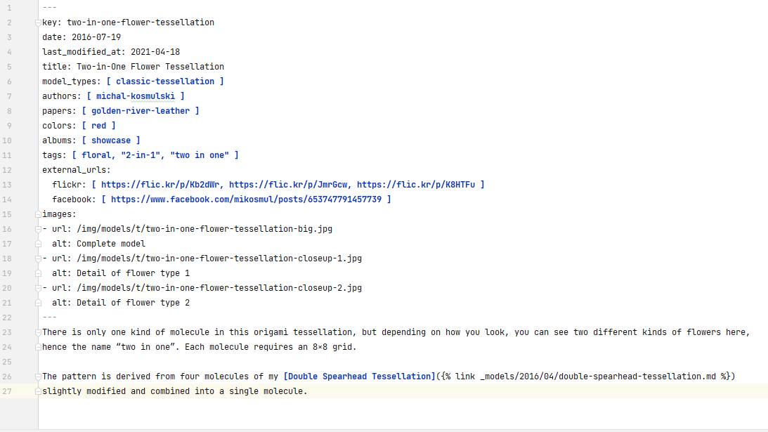
- It should be easy to keep a consistent look and format for all posts. I don’t want to be forced to manually insert a picture into a specific place in the text using some WYSIWYG editor. The best approach would be to have data separated from presentation as much as possible, i.e. for each model to just define a few fields such as: name, model type, image, etc., and use some kind of templates to present this data to the end user.
- It would be best to have several kinds of pages (but use structured data and templates within each), for example for models, folding instructions, and for longer articles.
- I wanted to also be able to create permanent pages such as About me.
- It would be great to be able to list models by different criteria rather than having just a single list.
- Content should be easy to find via Google and other search engines. Having at least some control over SEO would be very welcome.
- The site would have to look reasonably modern by the standards of the year I create it. Good experience on mobile devices is a must.
- Longevity: since I would be putting in a lot of work, I wanted to be able to expand and maintain the site for at least 5-10 years without major overhaul (but, technology being what it is, I was aware I would probably have to perform some maintenance work once every 3 years or so). My previous site was dated and uncomfortable, but it was 16 years old, and I had only performed a single minor tech update during that time in order to improve the mobile experience from terrible to just bad.
- Scale: when I started planning my work, I had around 300 pictures on my old web page and close to 600 images in my flickr stream. I usually publish 2 pictures a week now, or around 100 a year. Given the expected lifespan of 10 years for the site, and the possibility of publishing a little more when I have better tools at hand, I expected the site to contain around 2000 images; 5000 images looked like a safe estimate on the upper limit of what the page might ever need to handle.
Can I achieve these goals in another way?
Maybe I could achieve these goals with less effort? Here are some options I considered.
Continue posting content to social media
I could buy a domain and redirect it to my flickr, facebook or instagram feed (due to the 240 character limit, I didn’t even consider twitter).
- Which medium should I choose to point my domain to? Each has its own set of limitations.
- Little flexibility. None allow much content except for “posts”, so even making a decent About me page is not possible. On some sites, you can have more than one image attached to the same piece of text, on others you can’t.
- Findability within the site varies: flickr has decent search while instagram has practically no way of finding content other than by hashtags (which is rather useless if all my posts are about #origami — I need full-text search).
- Findability in web search varies as well, but generally you have no control over SEO other than the content of texts you write.
- Browsing flexibility: flickr has albums for grouping your images; on other media you usually just have a single timeline, sorted by date.
- Scale: not a problem at all (instagram hosts over 50 billion images as of 2021), though for example flickr currently limits free accounts to 1000 images.
- Easy to update: some sites allow posts to be edited, others do not. But, most social media platforms are very much centered about what is current. Their whole design rotates around only the latest posts. Your posts older than a few days get practically no traffic, and if this is combined with a lack of useful search (looking at you, instagram), there is no point in updating old content anyway.
- Longevity: this is a complete gamble. Social media platforms come and go. In ten years, the landscape may be completely different than today. Many social media platforms allow you to export all your posts and other data in machine-readable format (a feature often well hidden even if available), but even with the data downloaded, migrating it onto another platform would require work and not necessarily produce great results. Vendor lock-in is an important factor to consider.
Use a hosted blog platform such as Blogger
Such a solution offers some of the advantages of a fully custom web page but also shares some disadvantages with social media. In particular, page layout options and the ability to create anything but standard “posts“ may be limited. Still, I think such an option has a number of advantages over just using social media and it might be the path I would choose if I could spend only little time customizing my web page.
In particular, hosted options exist for WordPress and Jekyll, two options described in more detail below.
Pay someone to build the site for me
This option may be best if you are, for example, an origami artist and need a “business card site” with a few examples of your work and contact information. A professional could set up such a site quickly and prepare better graphics than I ever could, all for a reasonable fee.
However, I rejected this option due to the large and uncertain scope of the project. I wanted my site to have quite a few custom things (such as separate templates for models, instructions and blog posts) but I was not sure up-front which were really important and which were not. Finding this out would be a big part of the design process. This meant that:
- either the web designer would have to know origami well enough to act in the role of a domain expert themselves (rather unlikely),
- or I would have to spend lots of time with the designer discussing all details and discovering the design in the process.
Either way, this would take lots of time, and, even worse, the exact amount of work would be very hard to predict. This would result in high and unpredictable costs. And in the more likely of these two options, I would be spending lots of time on the page anyway, so even paying someone to do it would not save me that much time compared to doing it myself.
Writing it all down
After careful deliberation, I decided I did need a custom website, and that I would be building it myself.
Note that the relative importance of different factors to consider may depend a lot on your situation. Since I feel quite technically-savvy, building the site myself was actually the first thing that came to my mind, and I just needed to check if there were any contraindications. For someone else, building the website with their own hands might not be an option at all. Likewise, acceptable cost may be different for different people, etc.
Very early in the planning stage, I created a README file in which I wrote down the goals and assumptions listed above. This helped me stay focused, and
when new ideas started popping into my head, it let me quickly decide which things I had to do and which were optional.
Project management
I also created a simple product backlog in the form of a text file with one idea per line, split into must have / should have / nice to have / maybe some time later categories. If I hadn’t done this and just grabbed each idea that came into my mind, I would never finish my work in any reasonable time.
As I progressed, I also started writing down in the README some conventions I would be using, and a decision log so that I could go back and revisit some
design decisions I would be making (for example: why are model instructions separate pages from models themselves?). Essentially, despite this being
a one-man project, I used a kind of simple project management, and it helped a lot. I would be doing the project in my free time, which is a limited resource
like time and money in “serious” projects. Each hour I would spend on the page, I would not be able to spend on something else (including actually folding
origami), so I wanted to get good results, but without unreasonably inflating the [time-]budget.
Technology choices
At this stage, it was time to choose the technology to use. My previous web page was written in pure HTML with just a few PHP-based includes for things such as menus and footers. How should I build the revamped site?
Doing it all by hand
I could continue to use hand-crafted HTML with some simple includes. This solution had a few advantages such as full control over generated HTML (possibly leading to good SEO and lightweight pages which would load quickly). It also had many disadvantages, the worst of which was that a page built in such way was very inconvenient to update. HTML, even just simple formatting, is quite verbose, which means lots of typing. I would also have to manually manage my images, including the creation of thumbnails for image galleries (this could be automated with ImageMagick, though). Another factor was a lack of templating engine: even with styles used for most formatting, I would need a lot of boilerplate HTML in each post/page, which would be very difficult to update consistently for all pages if I needed to change anything. I could handle this by extending my PHP includes, but then I would basically be creating a templating engine myself, and would probably end up with an inferior product created with lots of effort.
WordPress
WordPress is one of the most popular engines, powering many blogs and other sites, so it was one of the first options I wanted to check out. I was able to easily set up a test instance (not publicly visible) and started configuring some basic things in order to see how it would work in practice. I also started reading the documentation in order to find out what was possible, and looking for themes and plugins which might be useful.
This is where my issues began. The WordPress ecosystem is huge: currently there are over 8000 themes and almost 60000 (!) plugins listed on WordPress page. I tried to find a theme matching my needs: a simple, modern layout, with a menu on the left (now I know the proper term to look for is two-column layout, but I didn’t know that at the time). Unfortunately, I had a hard time finding such a theme: search criteria did not help much, and browsing hundreds of matches was really cumbersome. I’m absolutely sure such themes exists, probably many of them, but due to the huge number of themes available, it was hard to find them.
I also had a look at the documentation, trying to find out if I would be able to easily implement a feature I badly wanted, namely pages built around data and templates so that I would not have to manually ensure a similar layout for each model page. Again, I was overwhelmed, and on one hand I am sure I can do that, and much more, in WordPress, but on the other I felt that learning enough to get started would be a high barrier to entry. Probably for someone who already knew WP, it would be very easy, but I lacked the fundamentals, and there seemed to be a vast amount of knowledge I would have to catch up with in order to get my project done.
Jekyll
Jekyll is a static page generator: it does not use a database but rather a set of text files from which the final page is generated. I already had a little experience with it due to being an editor of allegro.tech blog, but what I wanted to build here was much more complex.
Jekyll is much less popular than WordPress and much simpler (also: in many ways less powerful). This proved to be an advantage since the number of available themes and plugins was much smaller, and thus I could easily check if something I needed was available or not. The simplicity meant I was able to skim over the documentation and get a basic understanding of how it worked in short time, and to find out that collections were exactly what I needed for my “template-based pages“.
Not having a database would be a limitation indeed, but not a very big one, and it also had advantages such as making maintenance and taking care of security easier. Another matter, one of personal taste and experience, is that as a developer, I am used to working with text files, and editing a bunch of files in an IDE felt like a convenient option compared to having to edit each page in a web interface in the browser. So, after some deliberation, I decided to try building the site with Jekyll and to see how it would work out.
Starting small
Fortunately, my father’s web page was even more antiquated than mine, and at that much simpler than mine, so it would make a good test bed for the new technology. I think testing by running a real project is better than building some throw-away mockup. Building the small site allowed me to get a feeling of what working with Jekyll would be like while performing some useful work. When I finished, I was quite sure Jekyll would be a good choice, even though I also run into a few of its quirks on the way.
Planning site structure
The phase of designing site structure started much earlier than looking for the right technology, but it continued even after I already started building the new site. This was a typical agile project where I started with some ideas about the product I wanted but refined those ideas along the way based on interim versions of the work. Still, it was important to have at least a rough idea of what I wanted before I started any implementation and not just rush right into coding.
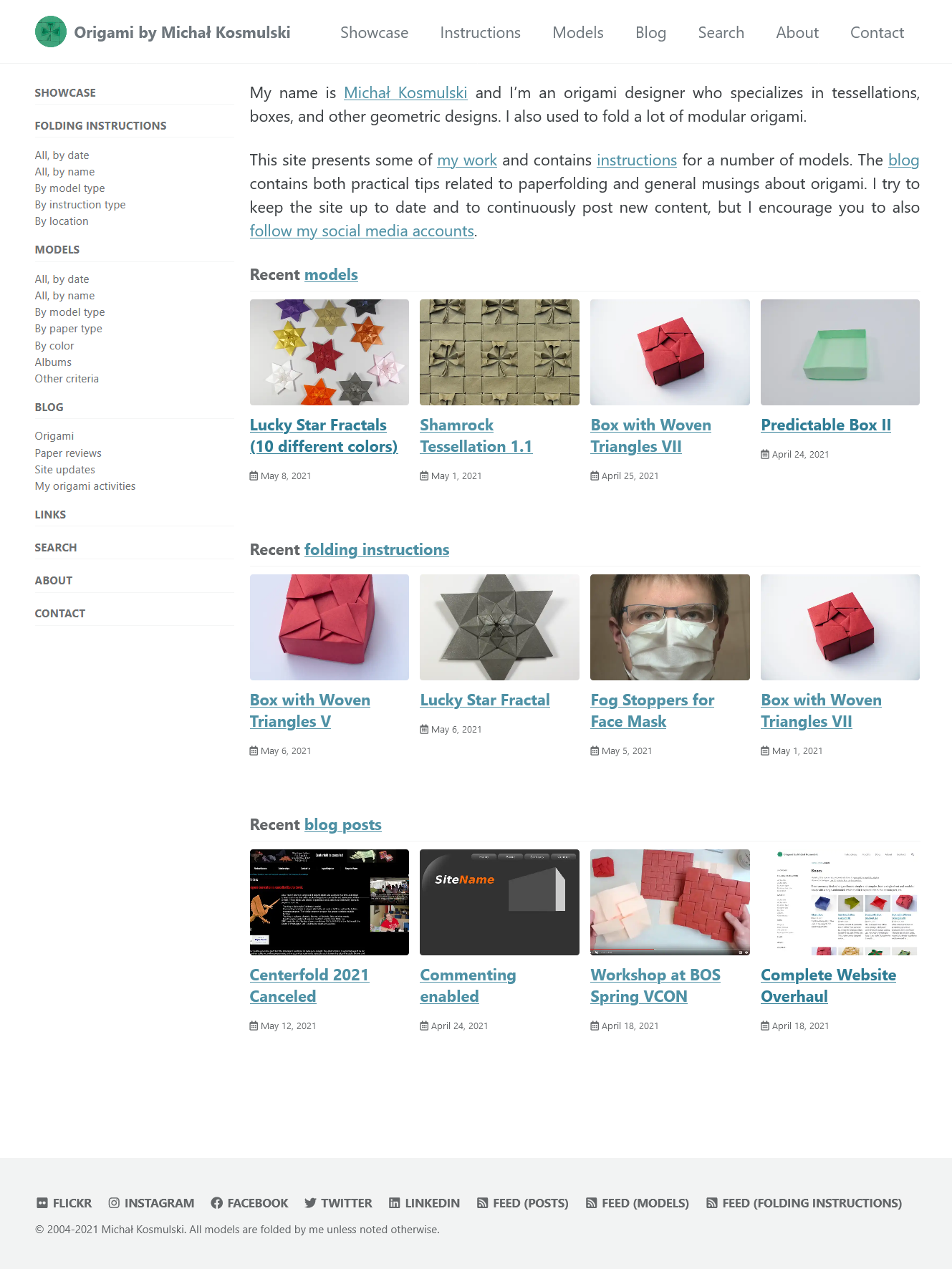
The specifics of the site structure are, obviously, much more tied to origami than other elements of the design process. I plan to write a separate post about this aspect of site design later, but the main point is: the new site’s structure ended up completely different from the old site. For example, the old site contained lists of pictures grouped into some categories. This could be confusing since all 3D anaglyph images were in a separate list, meaning you might have to navigate between different pages in order to see two pictures of the same model, one 3D and one regular. In the new site, all pictures of a model and all information about the model are on a single page. This also makes linking to models much easier since each has a unique URL, and I can have multiple listings of models (grouped by different criteria), each linking to the models’ individual pages.
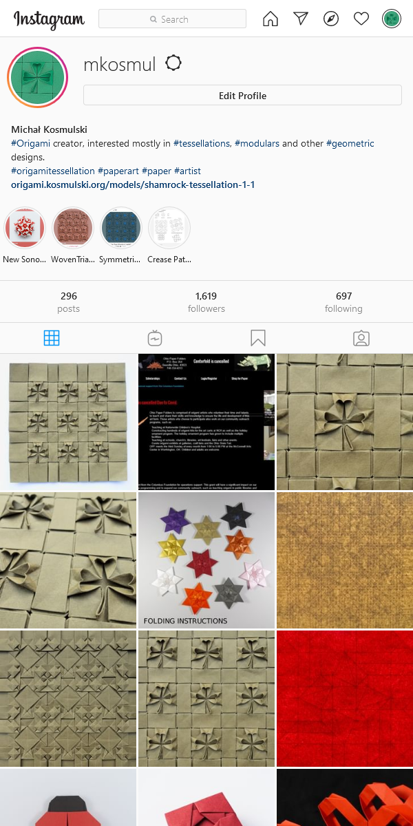
Despite all the limitations of social media, some contain really nice elements, and I tried to reproduce those which I found useful. Thus, model listings on my page clearly resemble the instagram timeline (but with text added), and I copied the idea of albums and of listing models by color from flickr. I also visited a number of other peoples’ personal origami pages for inspiration as well as some page galleries which contained interesting layout ideas.
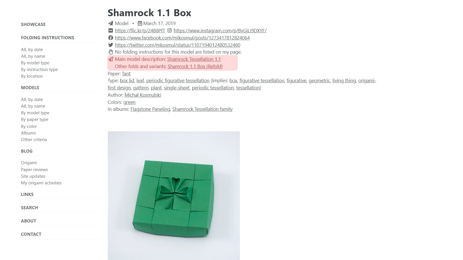
I also decided upon a few design compromises. One example would be defining what a “model” should be. One meaning of this word is “a unique design”, another “a concrete fold of a design”. Some information I wanted to present, such as information about how I came up with a design, belonged to the first type of “model”, but others, e.g. pictures and paper type, clearly pertained to the second meaning of the word. A neatly designed data model would call for the data to be normalized and to have separate pages for “model designs” and “model folds”. However, I realized having two separate pages would be very inconvenient for the user. Additionally, most of the designs on the page would only have a single fold. So, I decided that pages would be dedicated to “folds”, but one of them would be the “primary page” on which all information related to the design would be stored. This way, other folds of the same design, if there were any, could link back to the design’s description, but I would not need to create two separate entities for each fold I added. Despite being less elegant from a theoretical point of view, I think this was a better choice from a UX perspective.
Final choice of technologies
I ended up using Jekyll with Minimal Mistakes theme. I also made extensive use of several Jekyll plugins, most notably Jekyll Picture Tag (JPT) which solved my problems with thumbnail management. I also experienced great support from the author when I ran into an issue, which he quickly confirmed and fixed.
Getting the site up and running
I had to perform a little work on my .htaccess file in order to properly map the static html files generated by Jekyll to the nice URLs I wanted on my website. I also spent a little time on redirecting the addresses of all files from my old website to corresponding files in the new one. Failing to do this would have cost me a lot in search engine rankings since all the incoming links collected over the years would be gone, and I would be starting my SEO work from scratch. [Update: obviously, it would also break links to my page for human readers, which would be very bad as well.]
Web performance

Once the site was up, I used the webmaster tools Google and Bing make available in order to queue the page for crawling and to check how my ranking would fare. In particular, I wanted to check my scores for mobile browsing experience since making the page work well on mobile devices was one of this overhaul’s goals.
I also wanted to ensure the page loaded quickly. The site was static, so I expected performance to be very good, but checking wouldn’t hurt. To my surprise, the initial PageSpeed Inisights score turned out to be just 30/100 — a really poor result.
The main culprit turned out to be the website search feature I added. Since the page uses no database, site search is implemented in JavaScript (with lunr) and due to the large number of documents, loading this script was very slow. The first fix was to move search to a dedicated page so that the script would only be loaded on that single page rather than for each page visited. Additionally, I was able to cut the size of the script in half by using a smarter way of extracting unformatted text from the pages’ HTML: the original solution included lots of unnecessary whitespace which increased the file’s size and parsing time (I used Firefox’s web console to analyze page loading time in more detail).
I was also able to improve the page’s snappiness by improving image handling, since the site is graphic-heavy. The most important improvement was making all thumbnails lazy-loaded so that even pages with dozens or hundreds of images would still load fast. Another was minimizing the images’ byte size by moving from JPG to WebP format.
These simple changes brought my page to a score of 90/100 which I consider good enough, but there are still a few things I could further improve.
Lessons learned
I learned a lot in the process of building this page. I had to learn Jekyll much better than the basics I knew when I started. I also realized how much more complex building a decent site was in 2021 than it was in 2004: even though the theme I used handled most of the issues related to responsive web design for me, I had to hand-tune some aspects, especially those related to images. I also had to prepare custom CSS here and there and realized how powerful, and at the same time complex, it had become. On one hand, WordPress and Jekyll make creating a basic blog very simple, but on the other, once you start creating something custom, it’s not quite as easy anymore, and I think the complexity of the modern web makes the barrier to entry higher than it was in 2004.
As is common, priorities which I had originally outlined in my backlog, shifted over time. One example was paging long lists of models: at first I thought it was an absolute must-have, but then I learned that in my use case, implementing it would be much harder than I thought. At the same time, I realized that with lazy image loading, long pages were much less of an issue than had I expected, and the priority changed from “must have” to “nice to have”. Such changes were exactly what I had expected, and thanks to taking an agile approach to design, they were not much of a problem; instead, flexibility allowed me to end up with a better design that my initial vision.
Summary
Building the site was a lot of work, but also an interesting learning experience. In a few years, I should be able to tell if I made the right decisions. I’m still improving the site, but it’s mostly just adding content now: the framework itself is practically ready. I hope you found these notes interesting, and I hope they will be useful to others trying to build their own websites.
Comments